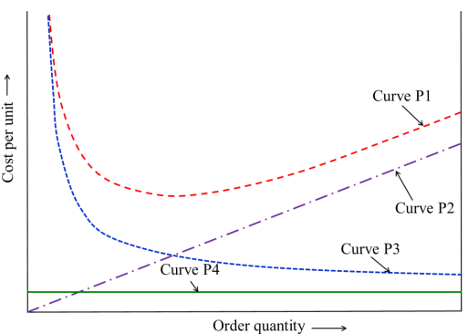
With reference to the Economic Order Quantity (EOQ) model, which one of the options given is correct?
Correct Answer :
Curve P1: Total cost, Curve P2: Holding cost,
Curve P3: Setup cost, and Curve P4: Production cost.
Solution :
Correct Answer:
Curve P1: Total cost, Curve P2: Holding cost, Curve P3: Setup cost, and Curve P4: Production cost.
Step-by-Step Explanation:
To identify the curves correctly, we analyze the behavior of different inventory costs as a function of the order quantity (represented by the variable Q on the horizontal axis of the graph, labeled "Order quantity →") and cost per unit (on the vertical axis, labeled "Cost per unit →").
1. Production Cost (Curve P4)
The production cost or purchase cost per unit is typically assumed to be constant in the basic Economic Order Quantity (EOQ) model, meaning it is independent of the order quantity Q.
Mathematically, the unit production cost is:
Because this cost does not change with the order size, it is represented by a horizontal line. Looking at the provided graph, Curve P4 is a flat, horizontal green line, which corresponds to the Production cost.
2. Holding Cost / Carrying Cost (Curve P2)
Holding cost is the expense associated with storing and maintaining inventory. It is directly proportional to the average inventory level, which is calculated as .
The formula for the annual holding cost is:
where is the holding cost per unit per year. Since this is a linear function of Q starting at zero, it is represented as a straight line with a positive slope starting from the origin. In the graph, Curve P2 is a straight line increasing linearly, which corresponds to the Holding cost.
3. Setup Cost / Ordering Cost (Curve P3)
Setup or ordering cost is incurred each time a new order is placed. The number of orders per year is given by , where D is the annual demand.
The formula for the annual setup cost is:
where is the setup cost per order. As the order quantity Q increases, the number of orders decreases, causing the setup cost to decrease. This relationship forms a rectangular hyperbola. In the graph, Curve P3 is a downward-sloping curve that decreases as Q increases, representing the Setup cost.
4. Total Cost (Curve P1)
The total inventory cost is the sum of the setup cost, holding cost, and production cost:
Summing these components results in a characteristic U-shaped curve. It starts high (dominated by high setup costs at low quantities), reaches a minimum point (where holding and setup costs are equal at the Economic Order Quantity), and then increases (dominated by high holding costs at large quantities). In the graph, Curve P1 is the upper U-shaped dashed line, which corresponds to the Total cost.
Conclusion:
Matching our derivations to the curves shown in the image:
• Curve P1 → Total cost
• Curve P2 → Holding cost
• Curve P3 → Setup cost
• Curve P4 → Production cost
Access expert-curated educational resources and study materials—completely free.
Create, conduct, and manage professional online assessments with Crey. Perfect for teachers and institutes.
Copyright © 2026 Crey. All Rights Reserved.